Social change advertising is suffering from compassion fatigue and is becoming far too easy to ignore. So how do you refocus, double-down on distinctiveness and make your messages more memorable?

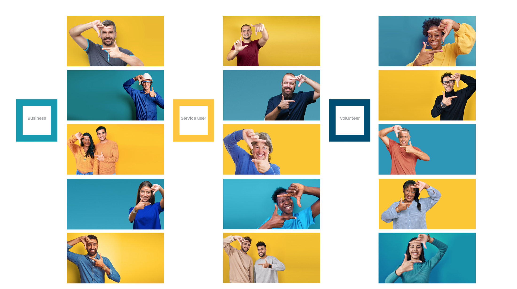

In our experience of creating brands, strategies, and campaigns for many social enterprises and not-for-profit organisations across the UK, we’ve learned that clarity and standout are paramount. We’ve also learned that support providers need two things most from communication.
Firstly, for people in need to know you are there to support them. Secondly, for people to know that you’re there so that they can help/partner with you.
In the same way that the “squared” brand talks about ‘more’, we created a campaign that does both of these things, with clarity. Multiplying the power of their communications, whilst also empowering the audiences.
We also focused and amplified the brand’s distinctive assets to make them more recognisable and memorable, creating cues as to who is communicating by using a small number of elements and colours.
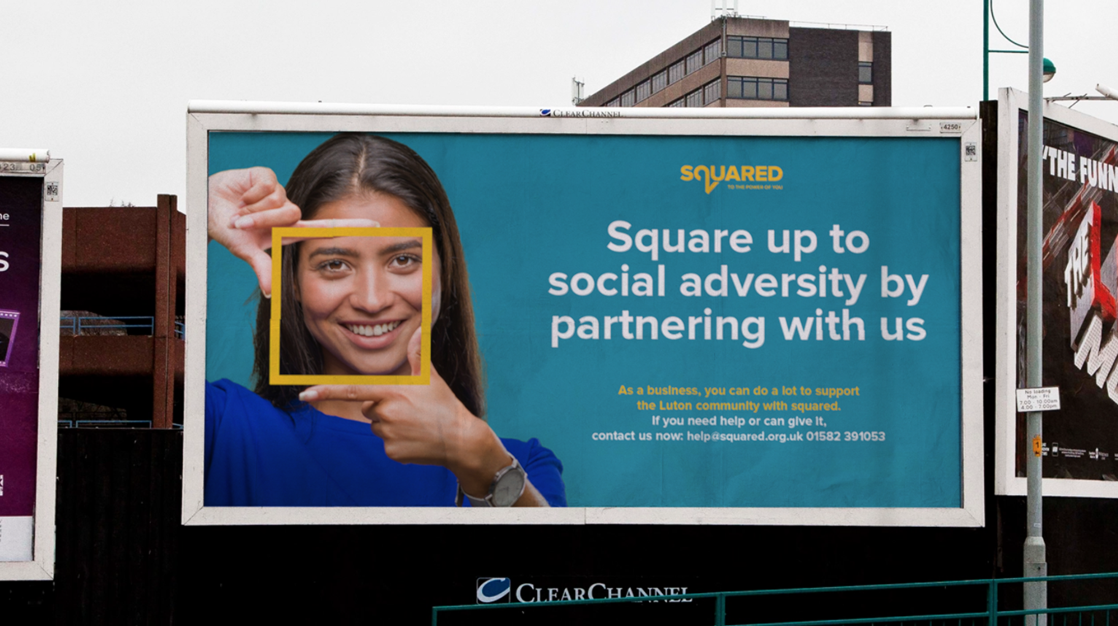
The final campaign was about the future, reframed.
Prompting people to see outside their trapped, boxed-in feelings and show those in trouble a brighter future. For others, we want to open people’s eyes to the problems. It’s all about reframing a situation that is becoming too easy to ignore.